I originally started working on these back in November, but with various illnesses and vacations, the end of the year was more than usually hectic for me and I just couldn't seem to get past the "sealing" phase and into the "resin pouring" phase until late January. Then, some of the pieces take more that one pour to finish plus there's all the photography and photo editing that has to be done.
Whew! I'm so glad these are finished.
I had a whole new crop of artwork and some new bezel shapes I planned to introduce, but only a few of them survived the whole process. Some of the artwork turned out to not be the size it was advertised and my attempts to fix that on my own computer have met with dubious results which I'm really bummed about because the pictures were really terrific. Sadly, they don't fit the bezels now so I'm going to have to do further head-scratching and research on how to fix them.
Then, I had a whole set of gorgeous peacock prints in square bezels that I was really excited about...but most of them didn't survive the resin process. I don't know what happened. I followed the exact same process I've been using for years, but nearly every one of the squares had some problem or other. In the end, only two of them survived.
But enough blathering on, here are the new pieces:

Out of all the new artwork I bought, this is one of the few pieces that worked out. I loved the soft colors in the design and this long rectangle is a new bezel shape for me as well. Definitely more of these to come in the future!

I don't know what Carmen Complexion Powder was or if it was good makeup or not, but the graphics from its label make a great bead. I sealed the image onto tiger ebony wood and then covered with resin. The bead is drilled top to bottom.

More vintage cosmetic graphics - great shades of purple and gold in this design. The bead is made from bayong wood. The warmth of the wood tones brings out the colors in the design nicely.

I'm not sure Crab Apple Toilet Water is something I would've used, but who knows? Maybe it smelled really great. Either way, I think the bead came out very well.

If you're not a crab apple fan, maybe you'd like some of Lady Marian's Toilet Water instead? Lovely peach tones in the artwork on this one.

I can't for the life of me make out the word on this bead, but the figure on it reminds me so much of Marie Antoinette that I named this bead after her.

This is another vintage cosmetic graphic for something called "Florida Water." I just liked it for the pretty flowers and the tiny fairy in the design.

What could be more perfect heading into Spring than this cute umbrella design with a mother and baby below it. There's some added glitter for extra sparkle.I can even see this being used in a baby shower gift design for a new mom - maybe with the baby's name included or something.

This is a really pretty vintage perfume ad - I loved her hat and the flowers, but thought it needed something so this one has a sprinkle of glitter in it.

This is a vintage cologne ad, but I placed it here because of the butterfly design which transitions really well into the next group of pendants. Plus, great vivid color on this one.

Even though it was November when I first started putting these together, I must've had Spring on the brain because most of the images fit that season...including this very dapper gray and red butterfly on vintage script. The bezel is raw brass.

This butterfly has brighter colors and is on a postcard background.

Now, even though this is a butterfly, I kept thinking it was more of a Winter image. Those blue postage stamps in the background looked like window panes through which you could see the dark blue of a winter evening. Then the white butterfly with its touch of red completed the winter color scheme. I even added a sprinkling of glitter to act as "snow." So, if you haven't quite transitioned from Winter to Spring yet, this may be the pendant for you.

Lastly, here's some more of the new artwork and new bezel shape. I loved the black butterfly design on the colored background. I added some glitter to give it a little extra spark.

Here's one of the new bezel shapes in a bright silver finish. Great artwork with that lavender rose. And some glitter again - can you tell that I missed working with my glitter?

More of the new artwork - I think the flower is supposed to be a peony.

Same artwork, but with a lavender flower. Also, love the touch of red on the thorns.

I went back to some of my more traditional artwork for this brass bezel and pretty pink roses on a jade green background.

My mom has a thing for irises so I always gravitate towards them when I'm looking for artwork. This image is from a vintage seed catalog.

As much as mom likes irises, I'm a pansy fan, myself. This image is also from a vintage seed catalog.

More of my new bezels - this one is a larger size and is pewter in an antique gold finish. The pale pinks and yellows of this flower image (along with some glitter, of course), are perfect for Spring.

Same type of bezel, but this one is in an antique copper finish. I thought it was a great contrast with the lavender flowers in the image. Glitter? Absolutely!

I've done kaleidascope images before, but I picked a few in more Spring-like colors this time. A Swarovski flat-back crystal has been added to the center for extra sparkle.

A very "Easter-like" palette on this one and this time, the center is a flat-back pearl.

More Easter tones, but with a crystal this time.

And, just to be completely different, I threw in one in darker tones of peacock, emerald and gold. A gold crystal was used for the center.

Of course, it wouldn't be Spring without birds, right?

I loved the message in French on this one. It's a little late for Valentine's Day this year, but it would be perfect for that type of a design. You can always get a jump on next year, right?

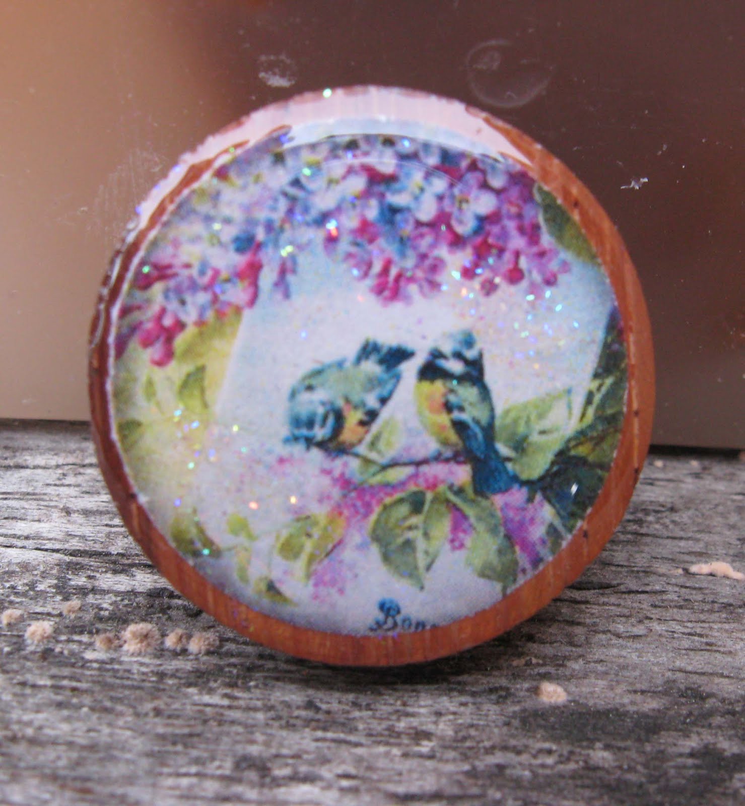
Because of the red breast on the one bird, I decided these are robins...which supposedly we have here in California, but I've never seen one here.

Three pretty birds, flowers and a nest box...I wonder if there are baby birds inside yet?

Great colors on this one with the blue background, pink flowers and yellow bird.

Another pretty yellow bird...this time with a nest.
This is probably my favorite of the bird images - the flowers are so colorful! I had to add glitter for a touch of a spring shower!

Then again, this one has pansies in it...maybe it's my favorite.

And here's one of the few squares that survived...along with a peacock design.

This is the only other square that made it. I had like 10 of them with all different designs. The only thing I can figure out is that the corners made it hard to get the sealant around, but I've done squares in the past and had no problem. I really don't know what happened this time. I supposed that makes these "rare" now LOL!

And now we're getting into my favorite section - the fairy designs. And okay, this one really belongs with the vintage cosmetic and perfume pieces, since it says "Fairy" right on it, I had to put it in this section. It has a touch of glitter and this is another new bezel style for me with the metallic "beads" around the edges.

This cute little cherub has a chariot pulled by butterflies. I want to travel by butterfly - that would be so cool! Same new bezel as above, but this one is in an antique brass finish and the other one is copper.

Here's the Fairy Queen all dressed in glitter and ready to do her magic.

Now this is something we all can use, right? A household fairy? I don't think my cleaning guy likes it when I call him that, though, so I just think it in my head LOL!

Here's a fairy with butterfly wings - I like the bold black and white stripes on her dress. This is the same new bezel, but this time in a shiny silver finish.

And lastly, my favorite of all the fairy designs - this pretty blue fairy in the silver bezel.
Whew! Glad those are finally done. I'll start listing them for sale on the Be Resinable Etsy site this weekend (hopefully).
Oh...and is your soup simmering? Mine's almost done...
KJ


