
Here's stage 1 of the bracelet:
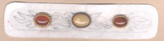
At this point, I've traced the basic bracelet outline onto the backing. I've glued the three cabochons (yellow quartz and dyed red agate) down and done the peyote bezels. I've also added an additional ring of beaded backstitch around the cab on the left. I later removed this ring because I didn't like the bead color I'd chosen. I re-did it in the same gold beads that I used to do the bezel on that stone. Lastly, you can see where I sketched in my "flame" design in between the stones.
Here's stage 2:
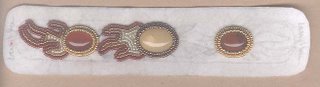
In this photo, you can see that I've completed a ring of beaded backstitch around each of the three bezels and I've begun to bead the flame designs on the left. I'm using three different colors of beads to do the flames - a transparent dark red, a transparent amber with an aurora borealis finish and an ivory gilt bead that basically matches the color of the center cabochon.
Here's stage 3:
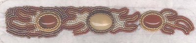
All of the flame designs have been completed and I've begun filling in the background on the left hand side of the bracelet with a transparent brown iris bead. If you look carefully across the lower left side, you can faintly see the working thread laying across the picture. I should have pulled it to the back side before I did the scan, but I was in a hurry.
This is my first attempt at a beaded cuff bracelet and I'm glad I designated it as "test/learning" before I started. I'm definitely not satisfied with it, but I've learned a lot in the process and my next piece should really benefit from this experience. If I were going to sell this piece, I'd definitely have a LOT of ripping and re-beading to do.
Since I like to end on a positive note, let's start off with the things I messed up on and go from there.
- Over time, as the piece is worked and handled, pencil marks wear off of the backing. I should've re-traced everything with a permanent Sharpie once the design was set.
- I like the cabs I chose, but in addition to measuring to space them evenly, I should have wrapped the design around into bracelet shape to check the positioning from there. If I'd done that, I would've realized that the two smaller cabs should be closer to the center cab so that they don't sit too far down the sides of the wearer's wrist.
- The flame design was a big risk for me. I NEVER freehand anything and now I know why. It looks nothing like flames - more like autumn leaves so I may have to change the name of the bracelet when it's finished. Also, with three cabs PLUS the flames, the design is too busy. I should've just done the three cabs OR done a larger center cab and then done flames all along the rest of the band. I should've created matching flame patterns, cut them out and used them to trace the design (reversing for the opposite ends) in order to make them match.
- I took another risk with the color scheme. These are not colors I usually work with...ever work with actually. I like colors, but I should've simplified and just chosen 3 and stuck with them, but I couldn't make up my mind. Also, sometimes with beads, it's hard to see what a color is going to look like until you've actually beaded a section with it and by the time I've put in that much work, I'm usually unwilling to change.
- If I'm going to sketch the design, I need to sketch every section and not just a basic outline and then I need to bead from the center out. Otherwise, I end up with weird little spots where I can't fit a bead or have to turn the bead a different direction to make it fit.
- The background bead color isn't right - not enough contrast to the flames.
- I haven't pictured the bracelet form and suede backing here because they're impossible to scan, but I learned a lesson there, too. When cutting slits in the backing to help it stretch and fit more tightly onto the form, don't cut so close to the form or the tips of your cuts might show.
And now for the positives:
- I'm glad I took risks with this project and wasn't hampered by my usual perfectionist tendencies.
- I'm still hoping when it's completely finished that the differences in the flame design will turn out to be a plus - making it look truly original and handcrafted.
- The stones are nice and I like the two colors together.
- The peyote bezels look nice in the metallics.
Okay, that's it on this one. See, I told you I learned a lot. I do have another test project that I started at the same time as the bracelet, but it's not nearly as far along. Still, I do have two scans of it and will post about that next time.
I'm looking forward to finishing both of these tests so I can apply what i've learned to a future project to improve the results.
KJ
2 comments:
Love the bracelet!
Thanks! I have to admit I'm getting a bit sick of it myself - just from having worked so long on it. But it's DONE! I finished it this weekend!
Post a Comment